Today we are happy to announce that we will be starting a long series of tutorials to show you how to build your own WordPress gallery without the need to purchase a plugin or script.
Each part will show you how to achieve certain functionality from the snazzy rollover effects to voting for your favorite photos. Our plan is to release a tutorial a week, with the final result being a full customized WordPress gallery.
Part 1: Image Rollover
In the first part we won’t actually be needing to use WordPress, we are going to prepare everything first then jump into the development later on.
You may have come across a dozen of inspiration galleries that have hover effects when you highlight an image, showing you how many comments, the title and even how many votes it has received. Some of this functionality will be provided by WordPress but until we get to that part later in the series I will show you the basics.
The below images are what we are going to achieve:

No hover state

Active hover state
The HTML
We will be using two javascript files which will give you the hover effect its core functionality which can be downloaded from the below links:
jquery_002.js – jQuery JavaScript Library v1.3.2
custom.js – Provides the hover effect which I will explain in further detail as this tutorial progresses.
Remember to place these two files in your “js” folder.
Create a new .html document and call it index.html. Add the below and save.
[html]<html lang="en">
<head>
<title>Code Your Own WordPress Gallery – Part 1</title>
<link rel="stylesheet" type="text/css" media="all" href="css/style.css" charset="UTF-8">
<script type="text/javascript" src="js/jquery_002.js"></script>
<script type="text/javascript" src="js/custom.js"></script>
</head>
[/html]
Now we begin coding the first part of the gallery:
[html]<body>
<div class="itemlarge">
<div class="back">
<div class="info">
<h2><a href="#" title="Gallery Image 1">Gallery Image 1</a></h2>
<p>Hover effect in motion.</p>
</div>
<a href="#" title="Gallery Image 1"><img src="images/testlargel.jpg" alt="Gallery Image 1" height="250px" width="560px"></a>
</div>
</div>
<div class="itemlarge">
<div class="back">
<div class="info">
<h2><a href="#" title="Gallery Image 2">Gallery Image 1</a></h2>
<p>Hover effect in motion.</p>
</div>
<a href="#" title="Gallery Image 2"><img src="images/testlarger.jpg" alt="Gallery Image 2" height="250px" width="560px"></a>
</div>
</div>
<div class="itemlarge">
<div class="back">
<div class="info">
<h2><a href="#" title="Gallery Image 3">Gallery Image 3</a></h2>
<p>Hover effect in motion.</p>
</div>
<a href="#" title="Gallery Image 3"><img src="images/testlarger.jpg" alt="Gallery Image 3" height="250px" width="560px"></a>
</div>
</div>
</div>
<div class="itemlarge">
<div class="back">
<div class="info">
<h2><a href="#" title="Gallery Image 4">Gallery Image 4</a></h2>
<p>Hover effect in motion.</p>
</div>
<a href="#" title="Gallery Image 4"><img src="images/testlargel.jpg" alt="Gallery Image 4" height="250px" width="560px"></a>
</div>
</div>
</div>
</body>
</html>
[/html]
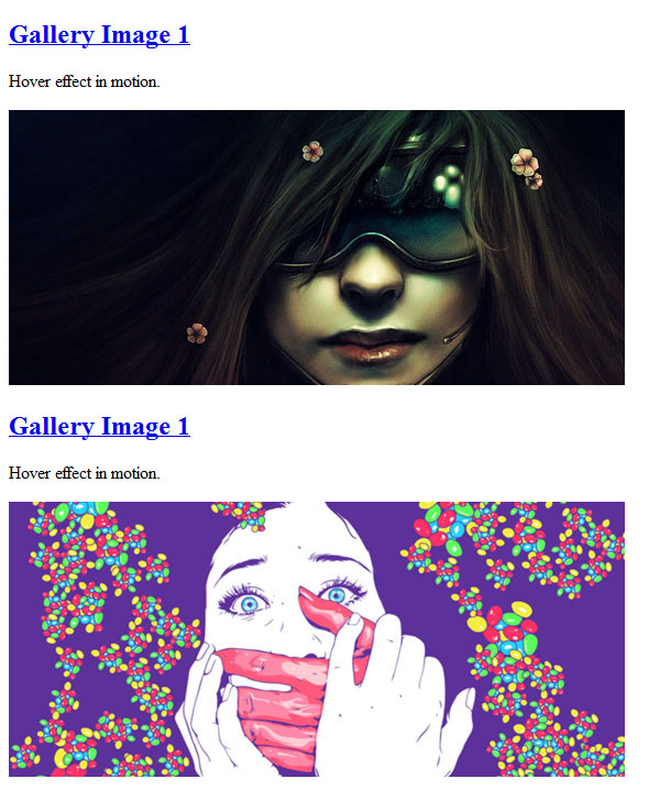
This is the outcome without any CSS applied which I will outline in detail in the next step:

The CSS
The css is relatively basic at this stage, which is fully documented so you can make your adjustments, from changing the size of the images to modifying the hover effect colour. Remember to save this stylesheet as style.css and place in the “css” folder.
[css]
.itemlarge {
/*set the width of your images*/
background: #ededed;
width: 560px;
height:250px;
padding: 4px;
float: left;
margin-right: 31px;
margin-bottom: 8px;
}
.itemlarge .back {
/*changing the background colour will modify the hover effect*/
background: #262626;
width: 560px;
height: 250px;
position: absolute;
color: #ffffff;
line-height: 0px;
}
.itemlarge .back img {
/*This hides the title and description so it will only appear when you hover over the image*/
position: absolute;
z-index: 2;
}
.itemlarge .back .info {
/*Position the description of the photo*/
position: absolute;
z-index: 10;
margin-left: 70px;
margin-top: 90px;
display:block;
z-index: 1;
text-shadow: 1px 1px 1px #000;
color: #fff;
}
.itemlarge .back .info a {
text-decoration: none;
text-shadow: 1px 1px 1px #000;
color: #fff;
}
.itemlarge .back .info p {
/*Position the description of the photo*/
margin-top: 20px;
text-align:center;
width:410px;
}
.itemlarge .back .info h2 {
/*Set the size of the photo title*/
margin-top: 28px;
text-align:center;
}[/css]
Now the CSS has been applied you should have something like this:

Everything is ready now but if you want to make further amendments to the hover effect you must edit custom.js which will allow you to modify the opacity of the rollver.
[php]$(function() {
$(".back img").css("opacity","1.0");
$(".back img").hover(function () {
$(this).stop().animate({
//on rollover the image will be at 10% opacity, you can change this to your linking but I believe 10% looks best
opacity: 0.1
}, "fast");
},
function () {
$(this).stop().animate({
opacity: 1.0
}, "fast");
});
});[/php]

i may would use that hover image for my new designi1 template (maybe for the next year :D)
Can be a pretty clean and cool effect!
Nice image hover tutorial, thanks.
Thanks for this great tutorial. Nice and useful feature.
There’s a way to do this on wordpress ?