Purple has been cropping up in designs alot recently, but how has one of the most unused colours become some popular?
Some of our recent submissions for our weekly showcases such as My First WordPress Template by tupa169 and zee7 both heavily feature purple in their designs.
Often the most used colour in many Bokeh and Abstract wallpapers, we have seen an increase of web interfaces and logotypes being designed around the colour purple. It does indeed seem that the colour purple is starting its own design trend!
Here are 10 beautiful purple logotypes for your design inspiration.
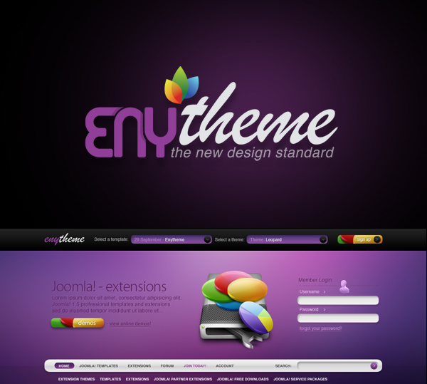
Joomla – Leopard Theme Logo by detrans
Poker Static by eyenod
think logo by CheeseTitans
Carol logo by RAYMON-BR
over logo’s by nemanjamilo
SHmIT ICE by Jdog0601
Imajendesigns – Logo by imajendesigns
Animal Wordmarks by designbolts
Omega by deoxgfx
Worth Of You Flowers by Shibin A
Blackbird Coffee Roasters by Alex Bogh



Thanks for the feature (Artistic Frames) and what a great collection!
Thanks for the feature! I went with the pink/purple because I liked the contrast it had against the black-over the other colours I use.
You should of mentioned out logo ;)
Noted for next time :-), great site by the way!
I wanna try on this color. Nice article. Cheers!
It’s a really nice colour and usually symbolizes prestige and luxury…think Mayfair in Monopoly [the most expensive area to rent or buy is purple colour]…so I guess it’s easy to see why there’s a new trend in purple!
Purple color makes me to see the logo design again and again. :) I found it attractive to me as Purple color and color create the glow of whole design of anything. Overall it’s great. Thanks for sharing valuable gift here. :)
Purple is a horrible, horrible colour. It is rarely used well and looks tacky, like yellow gold or crocs.
This is simply another trend, and as we all learnt at college, deign trends should be avoided by any designer worth their weight in Pantone swatches.
End of story.