Today is number fifteen in our Web Interface showcase!
As it seemed quite popular, I will be leaving my thoughts and suggestions to all layouts and logotypes featured each week with adding a few critiques along the way that will hopefully guide the designer into making their designs even better!
We are also proud to say that we have some fresh work from some new designers that haven’t be featured in any of our previous showcases on nenuno.
So please leave a comment with your thoughts on the designs selected this week and also do you agree with my our comments on the designs?
Please note that clicking on the screenshot below will take you to the full sized version and giving you the option to view the designers full portfolio.
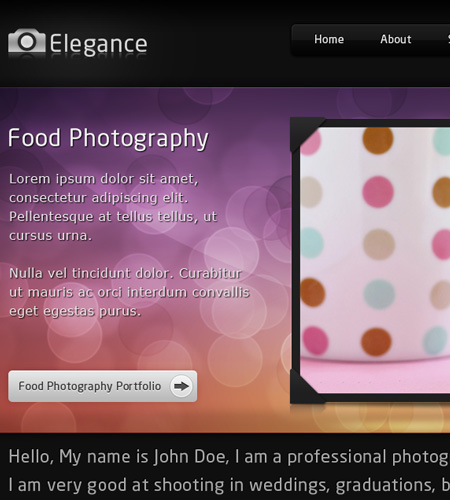
Elegance – Portfolio and Blog by justcollapse
Elegance is a beautiful multi-coloured theme. Making great use of bokeh gradients on a dark backdrop. The only critique for this interface would be vertical spacers in the content slider as they do feel out place with the rest of the design.
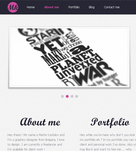
Mkastelov v.3 by TheDrake92
This is one of the most simplest and yet most effective designs this week. Making great use of custom fonts and well positioned content.
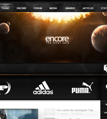
encore by noc0mment
Spacescapes in designs are becoming more and more popular I have noticed, not many interfaces can pull it off but works perfectly in “encore”. I would love to see this coded.
Thought Beans by deviant-bacha
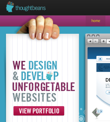
This design in my opinion just looks so smooth! The colour scheme blends well with the content and I am loving the “circle effects” that are featured around the interface. My only criticism would be to change the colour of the yellow boxes or to change them to small arrows.
Phenom Studios by Revoken
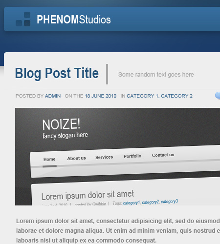
A very simple yet effective blog interface that could be used in any environment. The colour scheme looks like it can be changed quite easily which will give you an array of options to choose from. My only criticism is to remove or re-position the social network icons in the header.
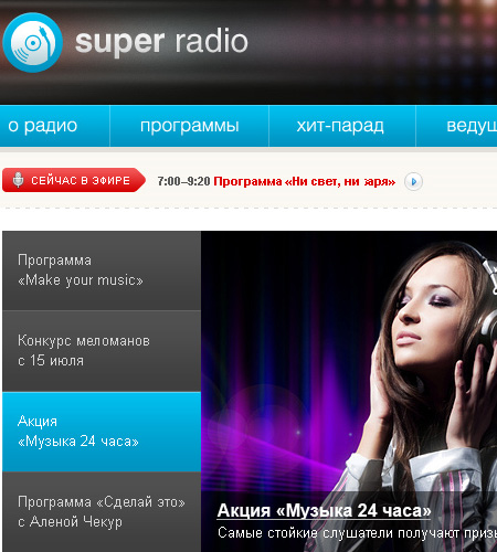
Super radio by lakinkley
I think this is the first time we have showcased a Radio portal on nenuno! I love the block feel for the content and if it was to be widgetized to give the user the freedom to move the content to where they wanted it would give more user interaction.
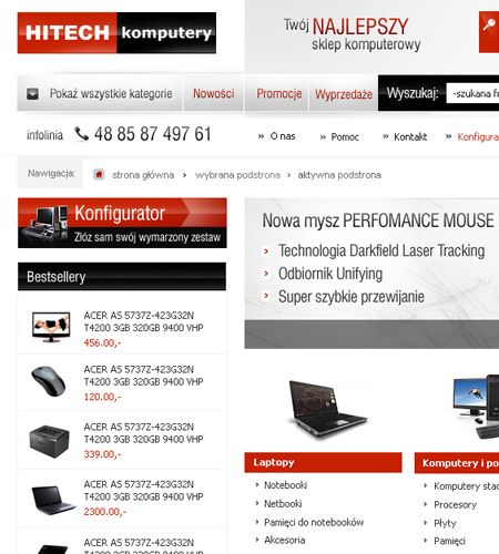
HITECH by finesy
E-commerce designs are becoming very popular on nenuno, each week we tend to feature at least one! This week is no exception with a simple yet effective design showcasing IT products.
SukaSuka by foxstep
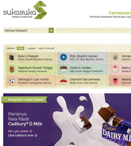
You have probably already noticed that I love simple and clean e-commerce designs and this is no exception. I love the category selection with the small icon displaying what each category represents.
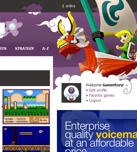
Nes-Games.net by kibus
A fantastic example of a flash games portal, giving users the chance to replay some of their favourite childhood games (in my case that is!). I am not sure why they picked Zelda The Wind Waker for the header graphics as it was a Gamecube game, but it does work well in this design regardless!
On a side note, we are looking for some of your contributions! Got something creative to share with the community? Now is the perfect time to get involved! Learn more about Contributing.

