Postcards are one of those marketing materials that need an extra dose of eye candy to grab attention. The success or failure of a marketing campaign rests in the few seconds it takes for the recipient’s eyes to glance over the postcard.
In this tutorial, we will show you a simple process for creating a dramatic text effect in Photoshop CS6. We will be using lots of layer styles so you can apply these designs on the go very quickly. The result will be an easy to repeat process that you can apply again and again to different projects.
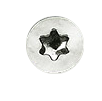
An optional resource we used can be found on the internet. We used this background to give our wood a bit more texture. If you don’t want to make your own bolts for some of the later steps, here’s a PNG you can use. Just right-click and save as:
Step 1 – Metal Pattern
Start by opening a new Photoshop file and making the file 6000 x 6000 with 300 pixels/inch. We want this large file size to give us a nice, clean pattern we can use later.
Now Fill the layer with a light gray, like #d6d6d6 and make the background color a dark gray, like #595959.
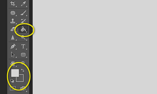
Then go to Filter -> Render -> Fibers. Use the following settings:
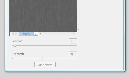
Now rotate the layer around 45 degrees and select as much of the image that you can:
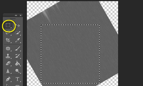
Go to Edit -> Define Pattern, and call it something you can remember.
Step 2 – Wood Background
Close the file out that we used to make the metal pattern and open a new one with the dimensions of 6 inches wide by 6 inches tall – hang in there as this will make sense shortly. Be sure that you have it set to CMYK and 300 pixels/inch.
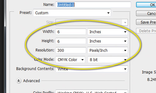
- Now fill the first layer with a light brown: #c5a25d. Set the background color to a dark brown: #706718.
- Now go to Filter -> Render -> Fibers again and use the same settings as before (Hit CTRL or CMD + F if you haven’t done any other filters since the last few steps).
- Now rotate your image 90 degrees in the Image -> Image Rotation option (either CW or CCW is fine).
- Go to Image -> Canvas Size and change the height to 4 inches.
Now place that resource from TextureBackgrounds.net into a new layer. We went ahead and rotated it and matched the height and width of our postcard. Set the Blending Options to Linear Burn with an opacity of 20%.
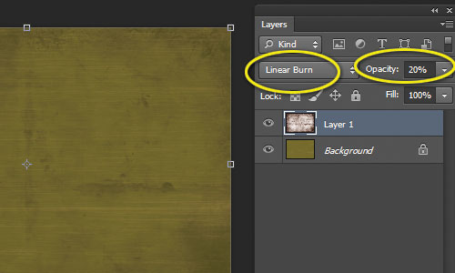
You should now have a nice, textured wood surface on which to start placing your text.
Step 3 – Text Setup
This is where you can add your own message, but for the sake of this tutorial we’ll just use a simple phrase. The Layer Styles we will be creating can be applied to any element in your design.
Place your text where you’d like it. We used individualized letters. Don’t worry about the color of your text right now. It’s smart to start using folders at this point if you have multiple layers.
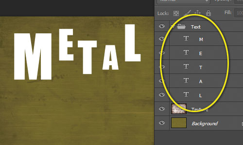
Step 4 – Text Layer Styles
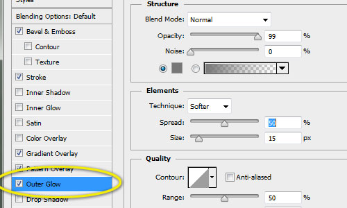
Select the first letter or line of text and open the Layer Style panel by double-clicking the layer. Apply the following settings and feel free to tweak as you see fit:
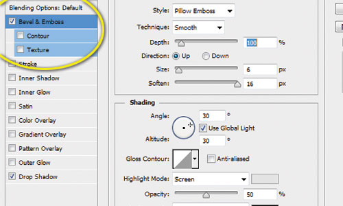
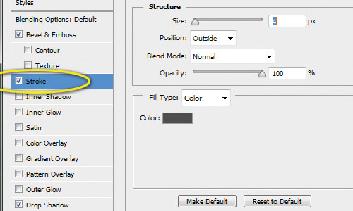
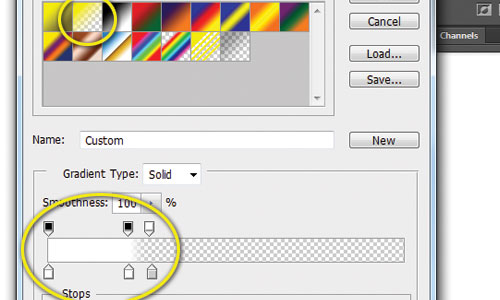
For the Gradient Overlay, start with these settings and then click on the Gradient design:
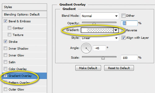
The goal is to get a sharp line where the gradient stops to give the results a glass-like effect:
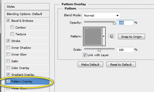
Here’s where we apply our metal pattern we created in the first step.
Step 5 – Create Layer Style
Open the Window -> Layer Styles pallete and click the New Style button while you have your first letter or line selected. Name it something to help you remember what this style does.
Now select any other text or elements you want to stylize with the metal finish and click the new layer style button you created.
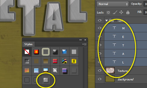
Step 6 – Add Screws
Either use your own screws or the one from above. Place at least two per letter to give the effect that the letters are bolted onto the wood. We put these in their own layer above the text.
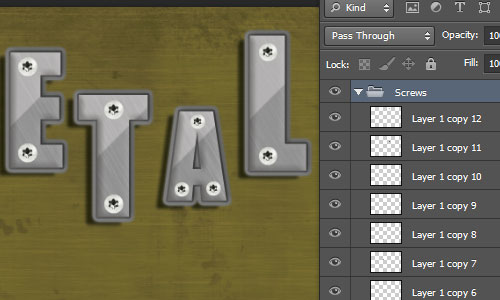
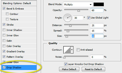
Let’s give these screws a bit more depth. With just one of them selected, open up the Layers Options pallete and apply the following:
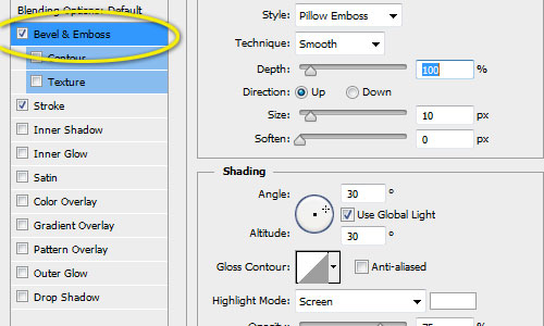
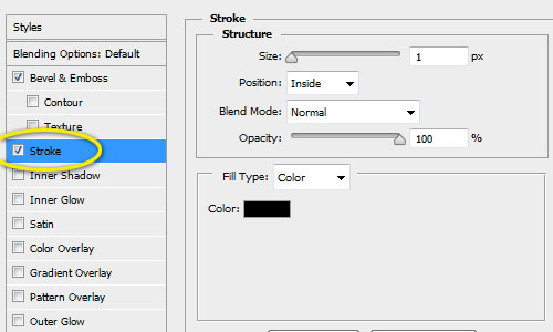
Now repeat the steps to create a new Layer Style in the Window -> Layer Styles and apply to all the screws.

Final Composition
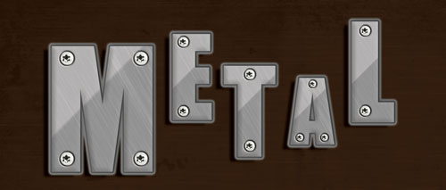
And here’s our final verson with a metallic text that we can quickly edit. It’s ready for any other basic design elements and can be quickly repeated using our layer styles.
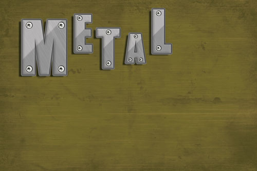
Click for a full-size version.
HINT:
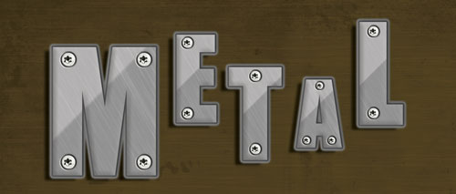
To give the wood a richer tone, use a layer above the background images filled with #633a1c and the Blending Mode set to multiply. Set opacity to taste.
Opacity set to 100%
Opacity set to 50%

