Today is number sixteen of our Web Interface showcase!
As it seemed quite popular, I will be leaving my thoughts and suggestions to all layouts and logotypes featured each week with adding a few critiques along the way that will hopefully guide the designer into making their designs even better!
We are also proud to say that we have some fresh work from some new designers that haven’t be featured in any of our previous showcases on nenuno.
So please leave a comment with your thoughts on the designs selected this week and also do you agree with my our comments?
Please note that clicking on the screenshot below will take you to the full sized version and giving you the option to view the designers full portfolio.
Cracky blog – for sale by Pilej
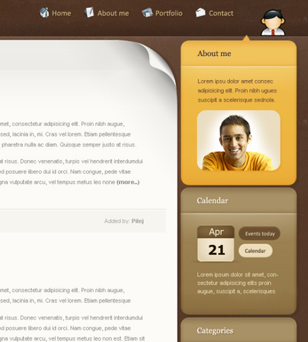
A simple, yet unique blog design. A nice color scheme that makes great use of gradients.
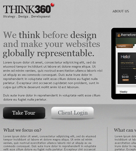
Think360 Design Studio by princepal
I love the work princepal produces, this multi coloured layout is no exception. This week simplicity has been a large factor and this is just that!
SimonVentura by versesdesign
A design making excellent use of stock photography which showcases various background options.
Limegarden by tomeqq
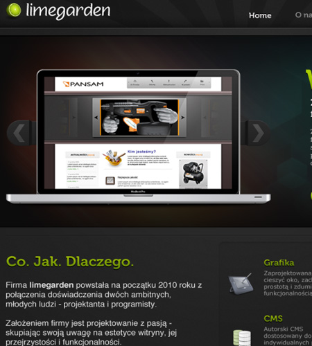
This design in my opinion shows you how well a dark interface can look! The colour scheme blends well with the content and I am loving the footer. My only criticism would be to change the social media buttons under the footer navigation, they stand out too much.
Delightful PSD Design by Revoken
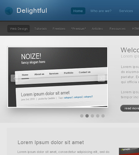
This theme is so “delightful”. It seems the current design trend is light gradients, blended into a blog/portfolio design.
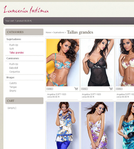
Lenceria Intima by pixel-free
Sexy, stylish and simplicity sum up this design in three words. Excellent use of stock photography showoff this simple e-commerce interface.
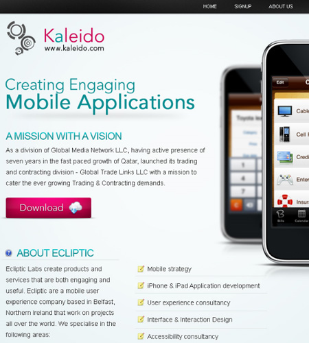
Kaleido by pixelzeesh
This design showcases a simple yet effective way of promoting your iPhone application. Loving the colors used for the fonts and buttons.
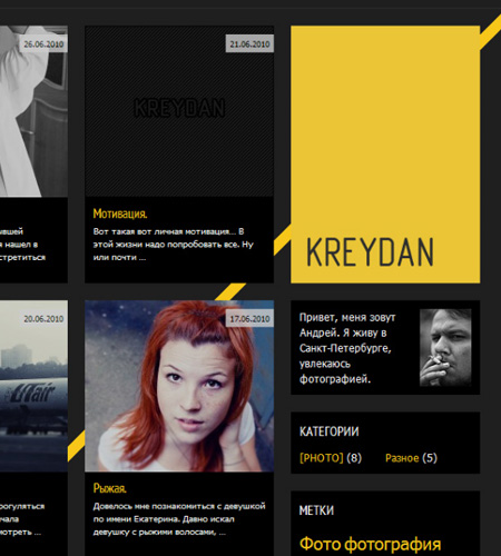
KreyDan.com by Glume-ru
One of my favourite designs this week. A simple gallery interface which makes excellent use of a color you don’t see often in web design “yellow”.
On a side note, we are looking for some of your contributions! Got something creative to share with the community? Now is the perfect time to get involved! Learn more about Contributing.


Nice collection of some good websites!
Thanks! I try and select the best designs each week.