Today is number fourteen in our Web Interface showcase!
As it seemed quite popular, I will be leaving my thoughts and suggestions to all layouts and logotypes featured each week with adding a few critiques along the way that will hopefully guide the designer into making their designs even better!
We are also proud to say that we have some fresh work from some new designers that haven’t be featured in any of our previous showcases on nenuno.
So please leave a comment with your thoughts on the designs selected this week and also do you agree with my our comments on the designs?
Please note that clicking on the screenshot below will take you to the full sized version and also some designers are featured more then once.
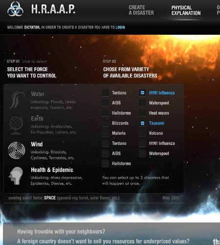
experimental by tehacesequence
This is a stunning design & an excellent concept for creating disasters around the world! The spacescape fits perfectly with this design and I can’t wait to see the finished product.
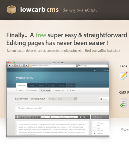
Lowcarb by alivepixel
Content is well spaced in this layout. Making great use of elegant gradients and custom fonts to make this design feel unique to the other one million application showcase websites out there!
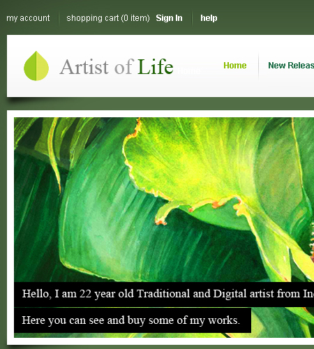
Personal Website Design by sreenijesus
I love traditional art and this portfolio draws all the attention to sreenijesus artwork. My only criticism would be to lower the opacity on the black bacground on the text as it looks too blocky.
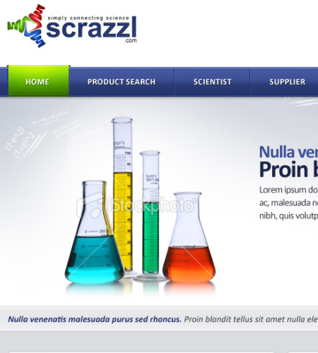
Scientist website by Nas-wd
Excellent use of stock photography showcased on a modern web 2.0 design with a logotype that doesn’t look misplaced.
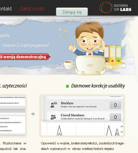
Testonic by jebanany
Making excellent use of a vector the header which fits in with the layouts colour scheme. The content text is a little on the small side but won’t be too much of an issue to fix.
sYnergy Clandesign 2 by elemeNt-XY
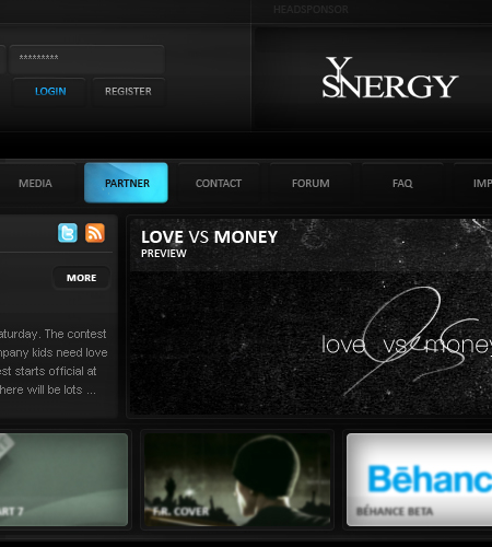
This is a very dark design which for a clan template can be hard to pull off, but the bright text and small banners give this design some much needed colour. I really like the rollover effect on the header navigation.
Clean Blog Template by tatostudio
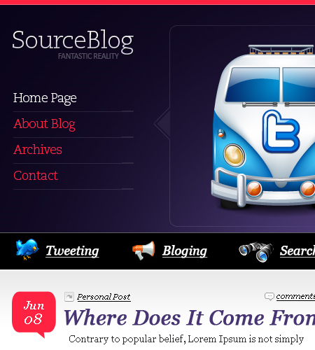
We have been showcasing WordPress blogs a lot these past few weeks and this is no exception. It has everything a blog needs from great content spacing, a well designed sidebar and footer. My only criticism is the black bar where the search field is. It looks to flat and needs some more attention and possibly changing the icons used as they don’t really reflect the rest of the great design.
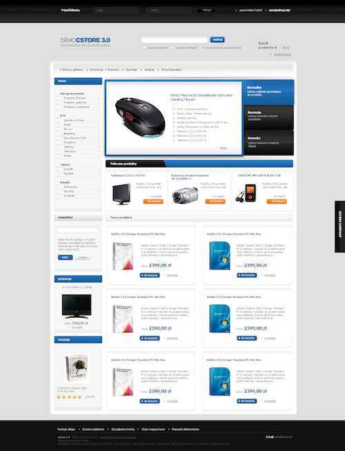
shop by amstaz
You have probably already noticed that I love simple and clean e-commerce designs and this is no exception. All products are layed out nicely and looks like that loads of customization can be done regarding design/product descriptions & featured products.
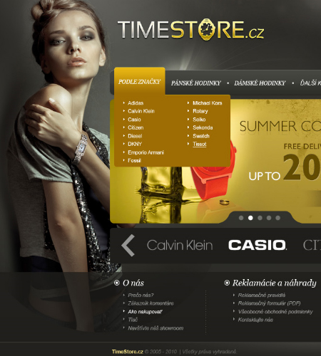
TimeStore by vladis123
For a landing page for a e-commerce store this screams “Beautiful”. I don;t really like brown and gray together but in this design they work really well.
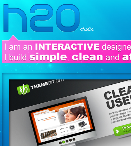
H2O studio design by jonaska
Who would of thought bright pink and sea blue would go well together? This is truly a fantastic design but would like to see how this would look coded. Could be a little tricky with all the transparent boxes and overlays.
On a side note, we are looking for some of your contributions! Got something creative to share with the community? Now is the perfect time to get involved! Learn more about Contributing.

Great collection of great web designs :D
and thanks for featuring my work