A logo might be a small symbol representing a particular company, but this little piece of art serves many a purpose. An effective logo is one that is easy to remember and in a single look reminds you of the company it stands for. It also draws your attention to the core values or functions of the company. Making an impressive and attractive logo keeping in mind all the above factors are not an easy task. But experts in the field mostly are successful in creating such logos. Often professionals take the help of symmetry to form an impressive and effective logo. 20 such amazing symmetrical logo designs are presented to you here.
1. Cinemadoom
A great logo design, in which the symmetry is used with perfection. The logo concentrates on the two major alphabets of the name, e.g., C and D. The two alphabets have been presented in a fashion to create a mirror image of each other. However, the alphabets have retained their uniqueness and are readable.
2. Mammo
The logo is an artistic recreation of the alphabet M that the name of the company starts with. The design of the logo is attractive and very creative. This is one of the brilliant logo designs where symmetry has been successfully used.
3. Blu Leone

Taking the name of the company quite literally, the logo consists of two identical lions designed on a blue canvas. The twin lions are put in a reverse position in the logo so that they create a mirror image.
4. Xhosa
XHOSA’s logo seems like a pattern created out of intertwined wires and threads. The color, form, pattern and every minute detail of the logo has been designed keeping symmetry in the center of the design.
5. Hugo & Mavis
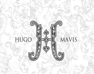
A close look at the logo of Hugo & Mavis would reveal to you the deep thought and creativity involved in creation of this symmetrical design. The designer has played well with the alphabets H and M while creating the logo. The first glimpse would reveal an artistically drawn H in among the words Hugo and Mavis. A closer introspection would, however, disclose two M in two halves of the H, one of which is upside down.
6. Corrida
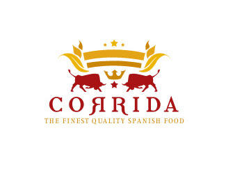
Bull fight and other sports related to bulls in famous in Spain. This has been used as the theme whiles creating the symmetrical logo of Corrida that deals with Spanish food. The logo has the two ready-to-fight bulls positioned at the downside of the logo. The bulls are facing one another thus creating an identical mirror image.
7. Lion Bird
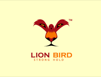
An amazing design that involves real creativity. Here the designer has not played with the alphabets of the name but chosen to display the twin characters of the name in a single image. The logo has a bird standing on its feet with half spread wings. One might miss out the entire design in a jiffy and may wonder about the pair of eyes in the wings. However, a little closer look would disclose a lion’s face hidden in the bird with eyes in the bird’s wing, the body of the bird as the nose of the lion and the feet of the bird serving as the mouth of the lion. This is a brilliant logo design where along with symmetry a lot of talent has been used.
8. Henland
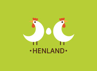
A simple design with good use of symmetry. Going with the name, the logo consists of two hen with mirror images and an egg in among them. Another angle of seeing the logo would reveal the alphabet H that the hens and egg come together to form.
9. Western Wrestler
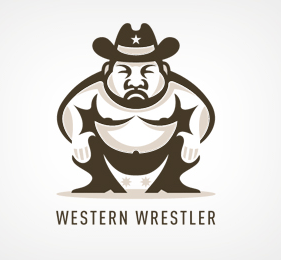
A wrestler’s image forms the logo of the Western Wrestler. The image has been designed smartly so that if vertically divided it produces the exact half of the image with the same lines and curves.
10. Trifecta
Simple and elegant symmetrical design forms the logo of Trifecta. The word T of the name of the company has been used to form the logo. The alphabet used has been presented in a stylish and beautified form.
11. Moneyledge

A perfect example of symmetry, the design of the logo deals with the prime alphabet of the name, e.g., M. The word M however has not been beautified here but given the look of a book to hint at the word “ledge” (which means ledger) that forms a part of the name.
12. Coviam
Simplicity at its best is what stands for the logo of Coviam. The symmetrical design of the logo is very similar to a four petal flower.
13. Mixedpome
The logo of mixedpome is an illustration of a pome or an apple. The image contains a mirror image of two seeds contained in the fruit that is outlined by three colors. The design is interesting and translates the name from word to image successfully.
14. Geekslove
The logo of Geekslove is smart, catchy, simple and significant apart from being a symmetrical design. The logo consists of a bow with two hearts at both sides. The bow might have been used to represent a geek whereas the hearts represent the word love. Thus, the two words of the name are demonstrated and the logo justified.
15. Evolution Bytes
This logo is an interesting example of a smart symmetrical design. The two primary alphabets of the name, E & B, have been presented in a way to create mirror images of one another.
16. DataKing
The logo is a simple image of a crown that represents the word King of the name DataKing. The crown is so designed that if divided into half vertically would produce a mirror image of the other half.
17. Goldielock
The logo is a simple image of a dog’s face. A keyhole in the middle of the face makes for the nose and mouth of the dog while hinting at the word lock of the name at the same time. This is another good example of a smartly designed symmetrical logo.
18. Equestrian Clothing
Apparently the logo looks like an image of a coat. But a little more notice brings out the fact that the image of the coat is made up of two mirror images of a horse.
19. LoveDoves
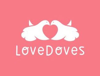
The logo is made using symmetry where two identical but reversely positioned doves are illustrated in a way to create a heart among them.
20. Stronghex
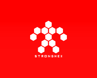
The logo is a symmetrical design that illustrates a strong looking figure. The design is simple and relevant to the name.
Logo designs with symmetry are quite popular. Symmetry is often chosen by designers to create a logo for several reasons. Symmetry in a logo design brings in elements of stability and uniformity in the look and feel of the logo. No wonder, such wonderful logo designs are created with the use of symmetry in them.
