Week 9 of our Logotype showcase is here! Featuring ten stunning logotypes from the past week!
This week we have some fresh work created by some very talented logotye designers and are honoured to feature them here on nenuno.
We also welcome back designers from previous showcases!
The nineth week of our Logotype Showcase is from the 1st to the 8th May 2010.
Please note that clicking on the logotype below will take you to the full sized version, giving you also the option to view the designers full portfolio.
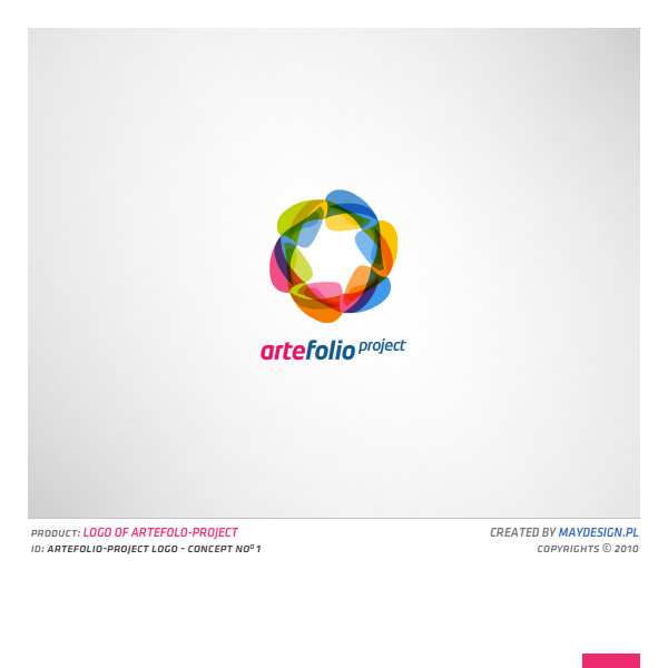
artefolio-project concept 1 by erroid
Simple shapes overlapped give this logotype a rainbow feel with the vast array of colours used.
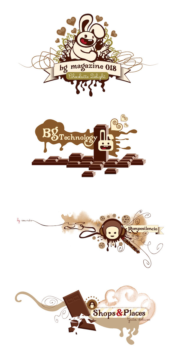
chocolate graphix by juan Pablo
An excellent logotype making great use of gradients and drop shadows to give off a 3D impression.
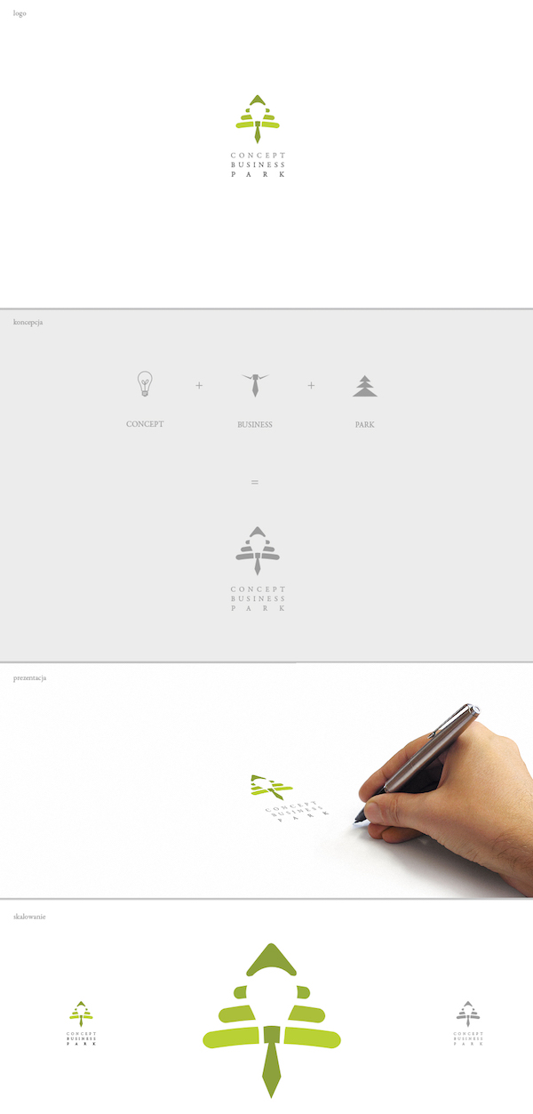
Concept Business Park by carlitoone
Putting three different concepts together has given this logotype a unique feel, yet it is such a simple design!
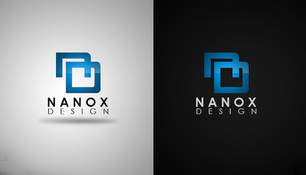
New Logo by NanoxDesign
Making great use of simple typography, it fits perfectly with the rest of the logotype.
tactcom by rachidbenour
A great font selection has done this logotype proud! Utilizing a simple gradient to give off a raised effect
Jazz Club by Ccrt
Ccrt has done a fantastic job at making a minimalistic logotype that emphasizes the word Jazz by incorporating a Saxaphone.
Oxygym by domiodomio
Oxygym is a excellent example of a vector based logotype.
Freedger by MaCiupa-eMCe
A beautiful concept for a e-commerce website selling Freezers & Fridges.
ecotaste by Yuka Highbridge
Simple and clean, just the way we like it at nenuno.
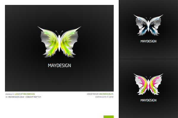
maydesign logo by erroid
This is one of my favourite logotypes for week 9. I have not come across a very detailed logotype in some time that is very effective.


Some great works here. I agree with the last one being the most impressive. However I like the Amber Lynn Logo the most. ^.^
huh thanks a lot for the feature ;)
Thank you for this award ; )))
Thank you very mutch for the feature =)
Thanks for featuring one of mine, this is really an exciting thing for me, being in college for design and all. Good to see what I’m doing is being liked by others. Thanks again guys. :D
Hi there!
Thanks for the feature!
Greetings!
Concept Business Park is very creative. I like that logotype a lot.