
Week 6 of our logotype showcase is here and we have hand picked a great selection of logos for you to enjoy.
We are happy to feature new logo artists this week and we hope to see more of there work in the future. Also we are trying something new with giving our personal opinionn for choosing the featured logo, please leave us a comment below to let us know what you think of this great selection.
The sixth week is the 10th April to the 16th April 2010, so lets get this party started!
Please note that clicking on the screenshot below will take you to the full sized version and also some designers are featured more then once.
Funkrush Logotype by schkalwal
LOGO Cherry P. by DKProject
![]()
LAMIN WOODS logo by fruitinduct
![]()
When I first set eyes on this logo, it instantly reminded me of the 70s. The colours and curves give this a retro feel.
Snowman logo by Tomasz Ostrowski
![]()
We are huge fans of logotype work and this week is no exception. A fantastic selection of colours to make a vibrant gradient effect which makes it stand out from the crowd.
Reveal logo by Tomasz Ostrowski
![]()
has done it again, using a similar technique used in quic lighters to which gives off a 3D effect.
Ari Baharat by cihanYILDIZ
I love the typography with the three leaves giving off a seasonal feel.
Loto Bianco by DKProject
We featured Truecolors last week and now has released a version two which combines the T and R together in truecolors. I am stumped to which I prefer more.
Clemenntagency logotype by okiz
This is the second time we have featured work from okiz and I bet we will see more work from him in the future. Clemennntagency is a great example of using vector art in a logos design.
Project Logo Theta Consulting by angradicalicious
![]()
Another great use of typography, where are you finding these great fonts? I am stuck with Helvetica LT Roman!
threecolors logotype by okiz
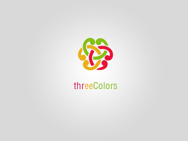
okiz has gone all out on this logo, the colours chosen work perfectly. The vector shapes slot together beautifully.
HITMAKERS DENMARK by GnuHest
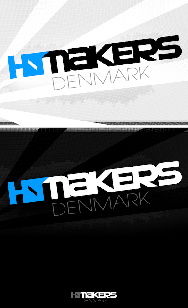
Out of the 15 logos in this featurette, this has to be one of my favourites. I just lovehow the HIT belends together without making the full word hard to read.
tope by con3x
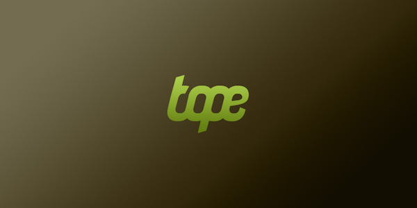
One of the simplest logotypes I have seen in a long time, untill you see the logo below which is also by con3x
modern Cross Layer / Card logo template by Habib Maulana Ikhsan
![]()
Another simple logo concept by con3x, making excellent use of the E to make it look like a leaf.
sound factory by fruitinduct
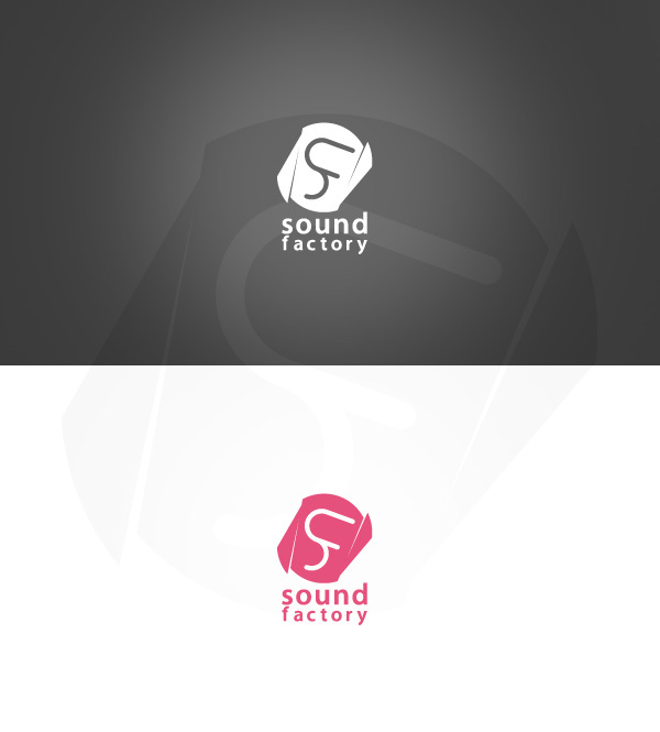
fruitinduct has done a great job with this logotype. It looks like the S and F were merged together to create the core shape of the logo.
Infinity Room by j1r1czech
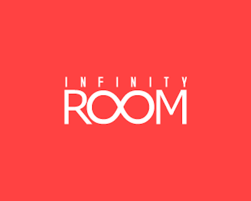
Infinity Room makes good use of simple typography with making ROOM the centre of attention.
hey thanks a lot for the feature. Great collection and a nice blog. congrats
Hi,
Very thanks for the feature. It’s very nice motion for me, and is some chance for smile in this jam for my country (Poland).
Bless ya.
Thanks for the feature, sweet blog btw.
Very thanks for the feature. verynice blog anyway….:D
don’t want to spoil the fun but that “plug in magazine” logo looks pretty much as quite dirty rip of the famous plug magazine logo:) http://www.jcpagan.com/files/gimgs/19_plug5.jpg
Inspiration is inspiration!
there’s a difference between inspiration and rip off. and this is a rip off. the “new” version doesn’t take the the original one and turn it into something new, it’s simply a not-that-well-executed copy. You’re speaking about the logo being clever in your comment – well it’s not, it’s a mindless copy of a clever logo. You could take any good logo and do this with it, that’s not what’s logodesign about, and it’s not right that these logos get any possitive feedback and attention.
Will remove the logotype, thanks raven for your comments. To be fair I have never come across http://www.jcpagan.com/files/gimgs/19_plug5.jpg but if I had, this logo wouldn’t of got featured.
Hi, thanks!!! ;-)
no problem, yep that’s what I thought.