Posters can be amazingly eye-catching when they are well-designed, even to passersby in a hurry. When created with a clear message, they are a great way to advertise.
However, posters are most effective when they are stunning and move people emotionally. Here is a collection of some of the most inspirational poster ads from around the world to prove just how attractive and moving a great poster can be.
Please let us know which is your favorite poster and why in the comments below!
Stay Green, Go Red
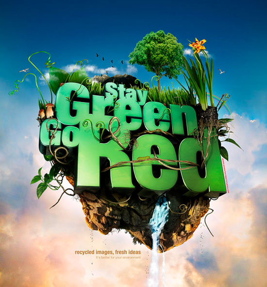
With a surreal image of a floating bit of earth, this poster design shouts a clear environmentalist message. The creative use of text is also inspiring.
BIRM

Not only does this image catch your attention, it illustrates a clear point. This medicine can stand up to anything. What an inventive idea for a poster ad!
Moravian Gold

Who doesn’t love to see modern images mixed with a scene that could be right out of a history book? The mug of beer is definitely the centerpiece of this poster ad.
Cobalt
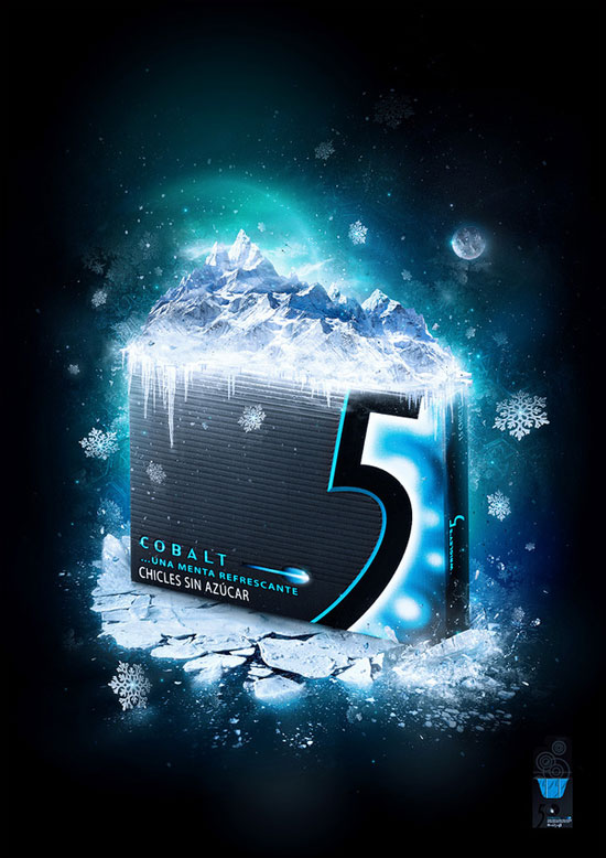
The icy mountain range atop the pack of gum certainly makes an impact. The stark contrast of the dark blue background and the white ice really makes this poster ad pop.
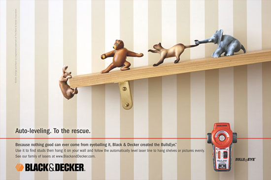
Black&Decker
WMF Knives
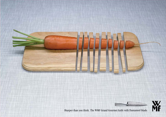
The designer of this poster certainly executed the idea behind this image very well. Simplicity can be more effective than a whole mess of content, as this poster clearly shows.
Pirelli
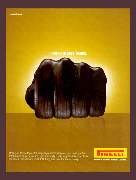
This image is just plain cool. Using the tires as fingers in a power fist really sends a powerful message.
Volvo
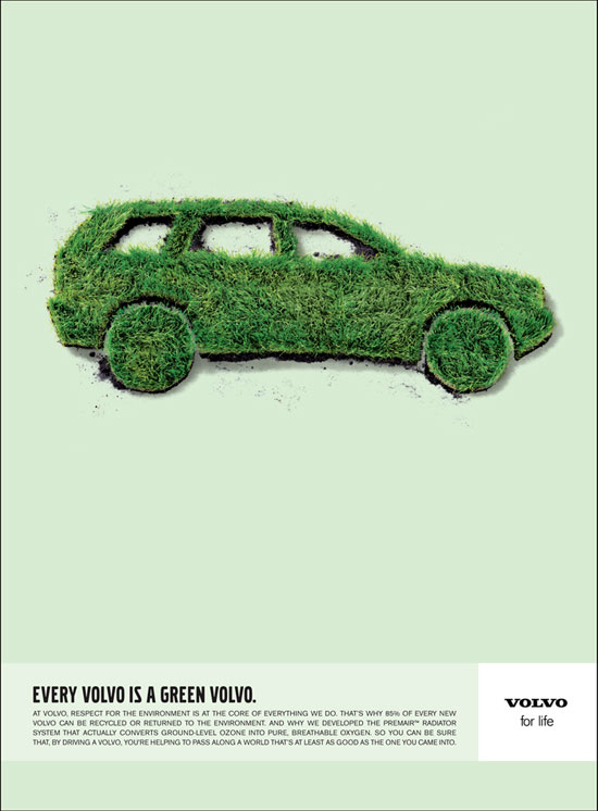
This poster ad is another simple yet effective design. Green grass is an excellent symbol of environmentally friendliness, and the Volvo shape is classic.
Archers

It’s the extensive use of white that makes this poster look classy while including an element of fun.
Nissan Frontier

You might say that this ad is a little overdone. However, it certainly does the job of being memorable.
Terra Sonora Music Channel
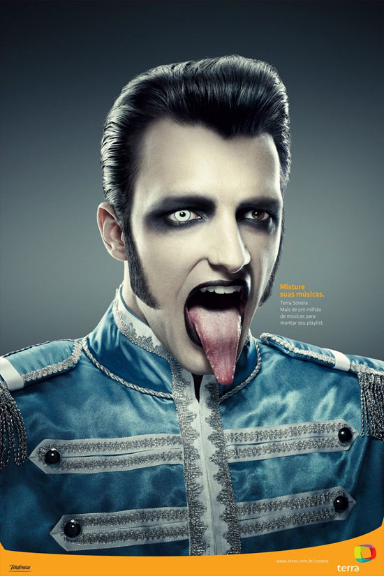
If Terra is interested in conveying a darker image, then this poster does the trick. This Brazilian radio station is advertising their “mix your own music” feature.
Kia Optima
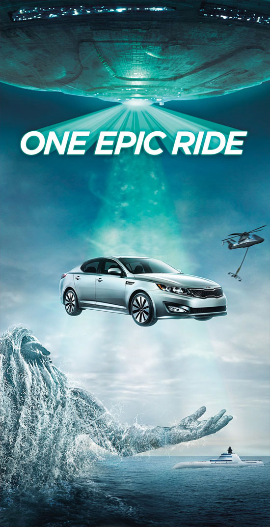
This poster ads serves the imagination with many, many grand stories. The cool effects are enough to grab attention; the oddity of it makes the images stick.
Orange TV
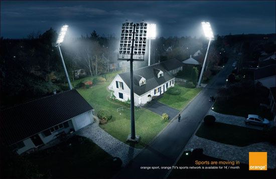
Taking something that is very much out of place and making it look as though it fits is very tricky. The designer has made it happen in this poster. It screams sports in your home!
Kohler
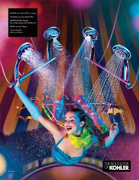
Bold is definitely the impression that this poster leaves with you. The colors are stunning and the message is memorable.
ENPA/Alpitour World

Using fun and impossible images are what make advertising work. The message is clear: your pets want a vacation.
Support Animal Free Circuses
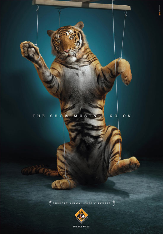
Sad without crossing the line, this poster plays on our emotions to get its point across. Well done!
PETA
This poster makes a lasting impression with an anti-fur message. The shock factor of the beautiful naked woman works in this case.
Shanghai Expo 2010
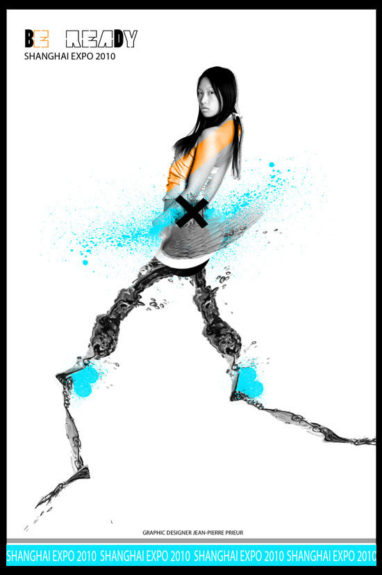
Strange images certainly grab the attention of their audience. The target audience here would be graphic designers, the very people who would truly appreciate this image.
Nike
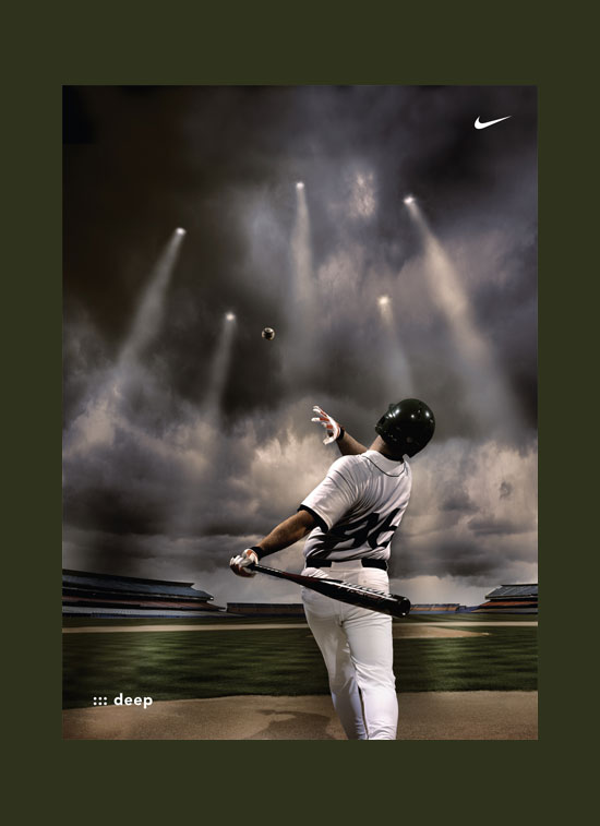
Simple, classic, and beautiful, this poster is nice enough to hang in a man cave. I think that NIKE is well represented here.
Adidas
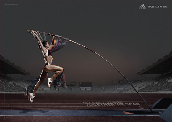
This is a very cool poster that makes you do a double take. It takes a second glance to really get the message, and that second glance is what makes this ad work.
Guiness

Dark and powerful, it’s what Guinness and this poster have in common. Awesome depiction of what the drink looks like in a glass!
Spoleto

Humor is always a great way to make a poster memorable. Mixed with eye-catching illustrations, a funny ad can be what moves an audience to choose this brand over another.
Nackadenim
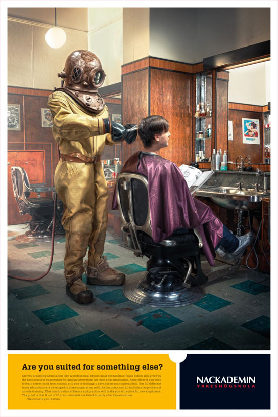
This poster ad is hilarious. Once again, placing an object or person way out of their element is certain to draw attention.
French Federation of Soccer
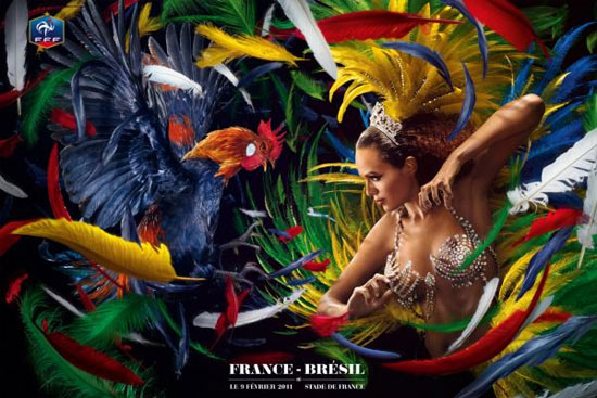
The brilliant colors and hidden innuendos make this poster beautiful to look at and fun to talk about.
Babyliss
Ouch! This message is received loud and clear, while the shock factor will never let you forget it.
Coca Cola – Belgium
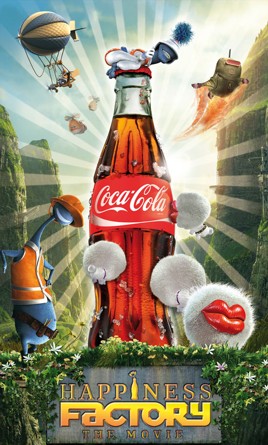
What a fun mix of beautiful landscape and whimsical cartoons! This ad from Belgium is definitely very eye-catching.
Perrier

The vividness of the melting heat is brilliant. The effect along with the sexy woman makes drinking water very appealing.
Li Ning
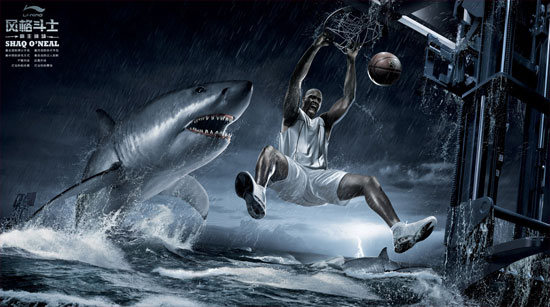
With an element of fear and fun, this poster would be great for hanging on a sports fanatic’s wall
Pastorini Toy Store

“We Bring Fantasy to Life” is the translation. That is precisely what this beautiful and humorous poster portrays.
SanDisk
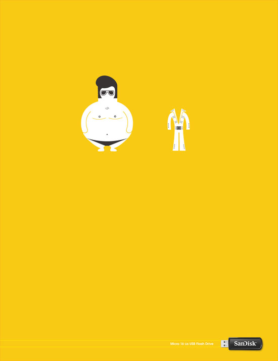
It might take you a second, but once you get it, this is a wonderful image to connect with a memory saving device. Much of the time, less is much much more. Great poster!

beautiful collection, can’t choose favorite!
I’m glad you enjoyed it!
My collection of creative ads – http://art-a-designer.ru/?p=69781
I browsed through your collection, and I must say it is impressive. Definitely worth checking out! Thanks for sharing. I’ll be sure to keep up with your updates!
Great posters! Certainly inspirational for a Marketing student like myself.
If I have to choose a favorite it will probably be the Orange TV ad :)
I love that one too. I think what captured my attention the most were the details, such as people walking by on the street. It’s brilliantly done.
These are beautiful poster designs! Thank you for sharing.
You are welcome!
I love the ad for WMF Knives, very sharp.