Today is number thirteen in our Web Interface showcase! As we were working on our own web interface this past week, this includes work from the past two weeks.
As it seemed quite popular, I will be leaving my thoughts and suggestions to all layouts and logotypes featured each week.
We are also proud to say that we have some fresh work from some new designers that haven’t be featured in any of our previous showcases on nenuno.
Please note that clicking on the screenshot below will take you to the full sized version and also some designers are featured more then once.
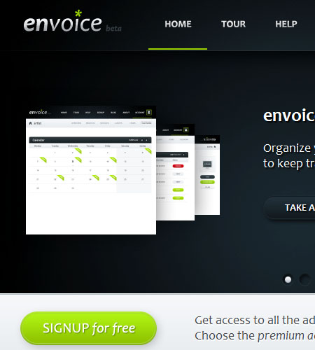
envoice Milestone 1 by artistandarchitects
envoice is a fantastic example of a showcase website for a web based application. The gradients in the design flow well with the white space whilst keeping the content well positioned.
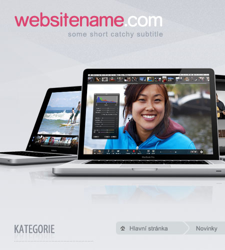
Clean eshop by Honya
As the title says, Honya has put together a clean and smooth e-commerce design that doesn’t look to cluttered.
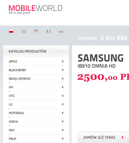
Mobile World by venom1209
Mobile World is a perfect example how a mobile phone e-commerce website should look like. Focusing more of your attention on the phones by using a light colour schme.
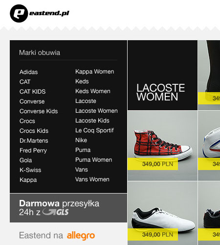
Eastend – shoe shop by keithar
Another e-commerce website that puts the products being sold first. Even though several different types of shoes are being displayed you don’t feel overwhelmed!
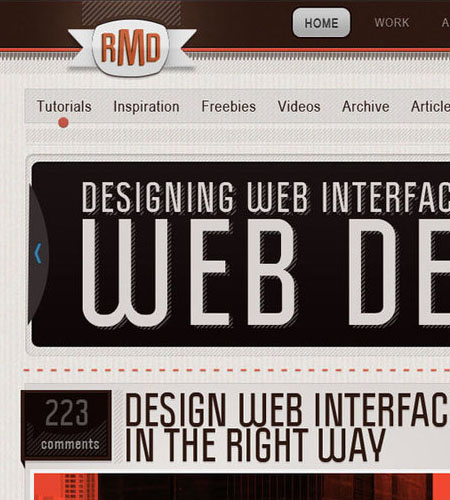
RMD WordPress Theme by Katro16
A well designed WordPress theme. Making great use of custom fonts which gives this template a grunge/urban feel.
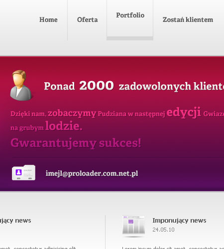
Simple, business layout by drekARTS
A lot of designs I have been coming across these past few weeks have been leaving empty space where the video will be. Taking a quick snapshot of an example video from vimeo and placing it over the video area would improve this design!
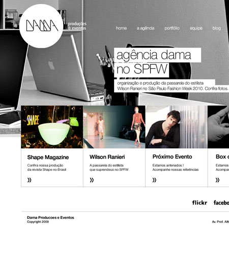
Agencia Dama Website by variant73
We featured the logotype for Agencia Dama in our last showcase and here is the full interface to go with it! A clean cut design that has lots of open space.
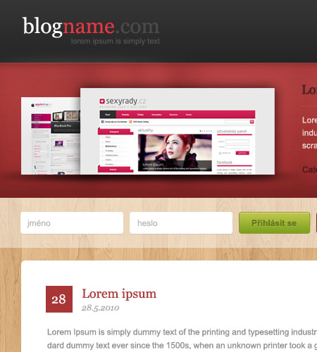
Blog design n.2 by Honya
Honya has yet again put together a fantastic WordPress theme design. Making excellent use of wooden textures and elegant gradients to give this a design a modern look and feel.
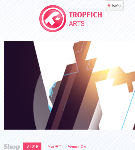
TropfichArts Shop New Layout by Tropfich
One of my favourite designs, the abstract/vexel feel shows off the fantastic T-Shirt designs Tropfich has created.
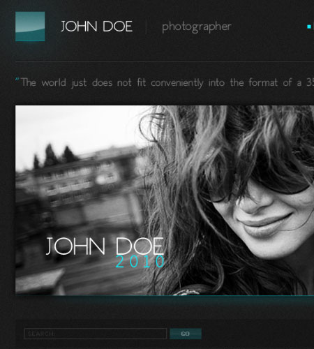
Photographer’s blog wordpres by wnek
A generic photographer WordPress theme that would suit anyone wanting to showcase their work. I would love to see how this design looks using colour snapshots instead of using gray-style.
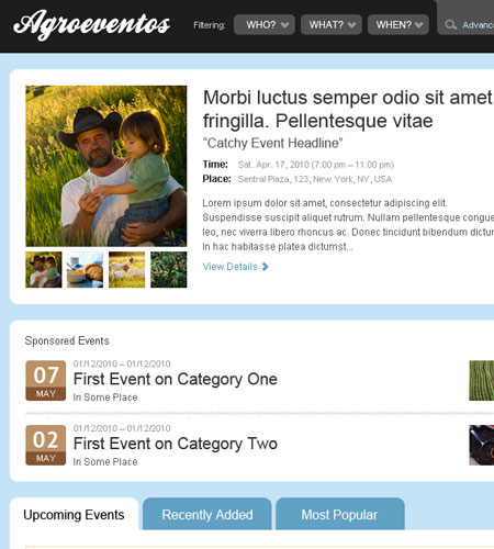
Agroeventos by skriki
A excellent example of well positioned content to go with a well designed background and footer.
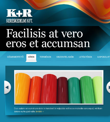
Printing industry firm website by floydworx
This design screams colour! The use of vexel gradients has made this design very unique and very attractive to look at.
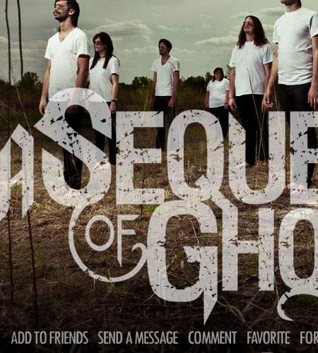
Myspace: A Sequence of Ghosts by stuckwithpins
I believe this is the first MySpace layout I have ever featured on nenuno? This design focuses on the bands logo as the center of attention which works beautifully.
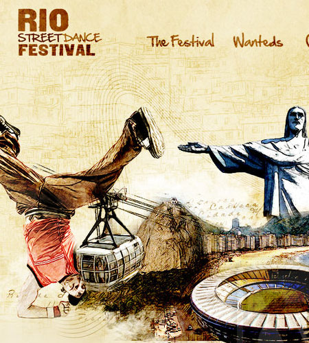
Rio Festival by TurokFreak
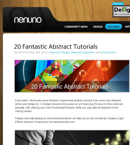
Last but not least, our redesign! Drafted by our good friends The WebCrafters. The overall design makes nenuno look less cluttered with making great use of white spacing.
On a side note, we are looking for some of your contributions! Got something creative to share with the community? Now is the perfect time to get involved! Learn more about Contributing.

Thank you very much for featured me on your blog. I’m very surprised.
I don’t have account on Twitter, but i will think about this. ;)
Definitely i will add your blog to my RSS reader.
Greetings from Poland.