Week 6 is here and we have hand picked a great selection of designs. Todays showcase is by Adam Harding, a good friend of mine and a great contributor to nenuno creative.
We are also happy to be featuring new work from designers showcased in previous weeks.
The sixth week is the 10th April to the 16th April 2010, so lets get this party started!
Please note that clicking on the screenshot below will take you to the full sized version and also some designers are featured more then once.
ThunderBlog
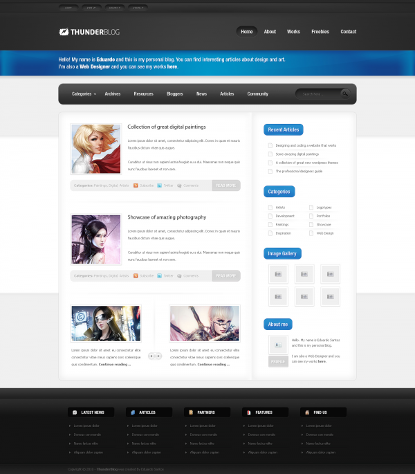
This is a nice blog design We particularly like the colours, the blue is not to loud and it fits in with the clean and concise layout of this interface design.
Personal Portfolio 2.0
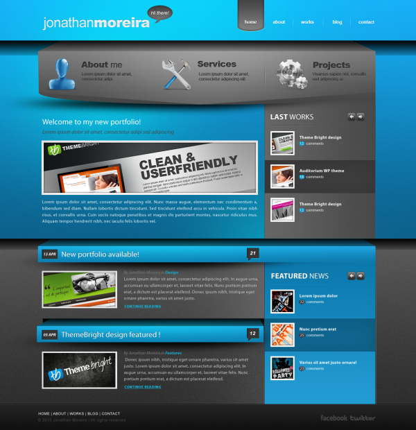
Im not a massive fan of the colour, but the design as a whole works really well. Although it is a really busy interface it works and keeps your attention, and you find extra little details each time you look at it.
Desitico Webdesign
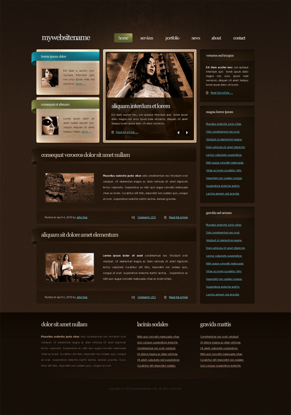
I am not usually a big fan of brown. This interface design works well however. The use of the light blue and vibrant green really complements the overall look of the interface.
Pieczatkownia
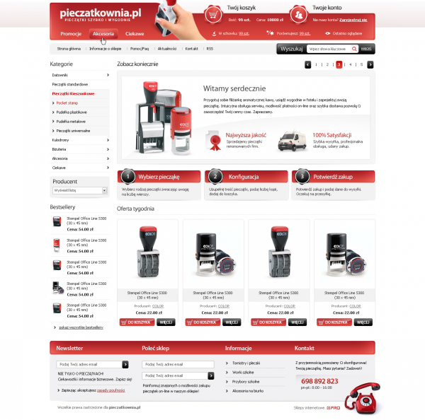
This is an excellent e-commerce based interface design. It has nice big promo areas to catch the attention of prospective buyers. The layout as a whole is well thought out and well presented.
Reptiles
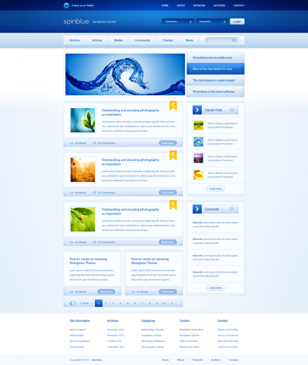
Having made too many gaming templates over the years I can be a little too critical of them, but I really do like this one. It does its job well and it isnt crammed with hundreds of content boxes and sub areas . The colours work well together and the design has a nice flow to it.
Mobile Content Website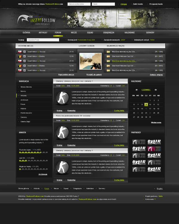
I love this design, I love the header and the colours, the whole site has been designed really well and a lot of thought has gone into its concept.
Andree Wallin Concept design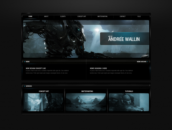
The Artwork is really the turning point of this interface, I personally feel that the artwork outshines the rest of the layout, but that is the kind of feel you want if you are an artist showing off your talent. In terms of the interface I like the typography and the little details such as the highlights make this design work.

Thanks a lot for the feature!!! Very proud to be here with all this talented designers! :-)
this is also nice http://crisfx.deviantart.com/art/Benevolence-portfolio-146304611