
Week 12 of our Logo and Logotype showcase is here! What a week it has been, the work being produced each week is getting better and better.
We have some fresh work created by some very talented web designers and are honoured to feature them here on nenuno.
The twelfth week of our logotype showcase is from the 23rd to the 29th May 2010.
Please note that clicking on the logotype below will take you to the full sized version and also some designers may be featured more then once.
Cakelab by liquisoft
AW logo+type by Raven30412
Serenity by MediaDesign
S3 logo by Emberblue
![]()
Dreamdust art – Logo by DreamdustART
![]()
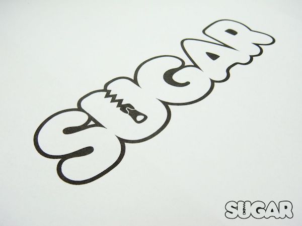
SUGAR by mayack
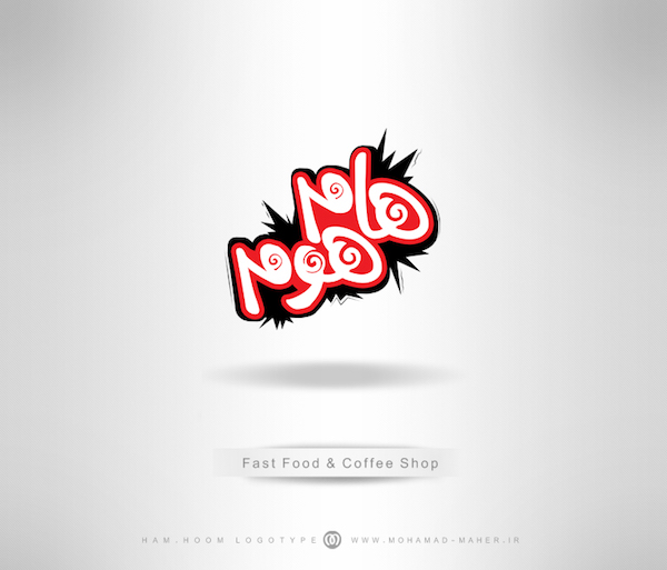
HamHoom by m-maher
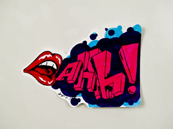
sticker1 by serg213
 OLYMPUS DIGITAL CAMERA
Maherat logo by ohmto
![]()
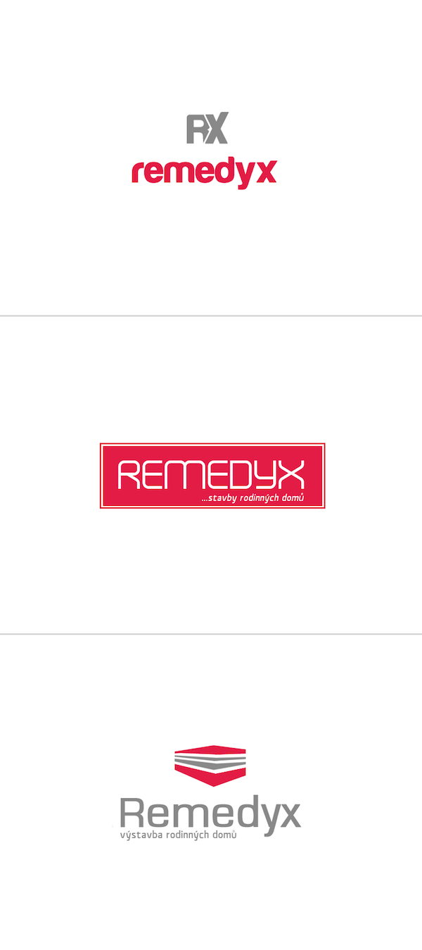
Remedyx – corporate identity by okiz
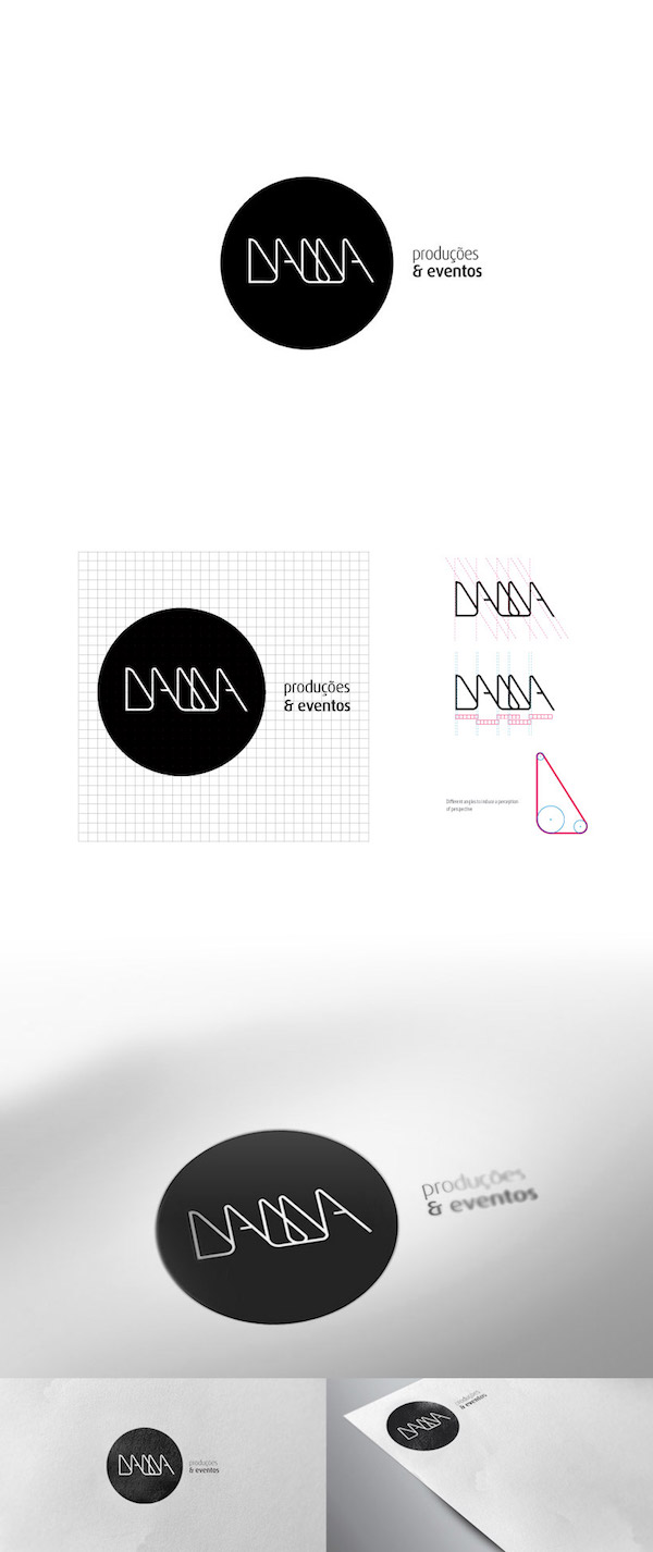
Agencia Dama by variant73
NasirTejarat by m-maher
Thinkcup logo by ilkeremreisal
![]()
drewnotex by carlitoone
Tax return direct by blur-media
On a side note, we are looking for some of your contributions! Got something creative to share with the community? Now is the perfect time to get involved! Learn more about Contributing.
I am honored that you included one of my logos in this collection. You have some great logo samples here. Thanks! :)
Hi and thanks for put my works in your website…!
Mohammad Maher
Some of these are interesting from a design standpoint. But I think they fall short of your earlier collections – I don’t think any of these are stunning.
I think a logo should communicate a message in under half a second. Admittedly, I can’t judge that on the ones that aren’t in a European alphabet.
The treatment of SUGAR is interesting. Without other words or images, though, I don’t understand the zipper metaphor. Is this a clothing company, aiming at a young, jaded audience – think Urban Outfitters – where the message of sugar’s sweetness – more likely not – is highly ironic? Or is this a scientific application, and the zipper tells us the company can unzip the molecule to combine it with other elements for new – what? Drugs? Flavors? Materials – especially biodegradable ones?
Remedyx is unfinished. The graphic floats above the main type, centered, while the small type is flush left. I want to shove the graphic over to the left so the whole thing is anchored on the left – an asymmetrical design is much more sophisticated than a symmetrical one. Or, I want to center the type under the graphic – but that’s boring and would have gotten heavy criticism in design school.
Also, that graphic could probably have some more life. As long as we’re doing an asymmetrical design, how about exaggerating the perspective or turning the angle more, and making the long side even longer than the other? Do the lines have to be so straight? How about adding some shading?
It’s a decent beginning, but it could go a lot farther. And it needs to go waaaaayyyy farther to get to stunning . . .
Hi there!
Thanks for the feature!
Greetings!