
Responsive website is so important to improve the experience of the user to access your website. Sometimes we have the need to view the source HTML code of a mobile website. Unfortunately, it’s not a native functionality to view the source codes on mobile devices although it’s a fundamental function for a desktop browser.
First, let’s have a refresh on how to view the source code from the 3 main desktop browsers, IE, Chrome and Safari.
Internet Explorer – click View -> Source on the menu bar. If the menu bar is hidden, click Alt to display the menu bar.
Chrome – click the menu icon on the top-left corner and then click More tools -> View Source
Safari – click Safari menu > Preferences > Advanced. Check Show Develop menu in menu bar. Close Safari’s preferences. Click Develop menu > Web Inspector -> Source.
How to view source code on iPhone and iPad
Here’s a trick using the Bookmarklet function as well as the service developed by Ole Michelsen to display the source code on iPad or iPhone. 1. First, bookmark the page you want to view the source code. 2. Rename the page name as ‘View Source’ 3. Copy the code at this page
javascript:(function(){var d=window.open('about:blank'),a=d.document;a.write('Loading Source');a.close();var b=a.body.appendChild(a.createElement('form'));b.setAttribute('method','post');b.setAttribute('action','http://ole.michelsen.dk/viewsource/?uri='+location.href);var c=b.appendChild(a.createElement('input'));c.setAttribute('type','hidden');c.setAttribute('name','DOM');c.setAttribute('value',encodeURIComponent(document.documentElement.innerHTML));b.submit()})()
4. Page the code at the url input box of the bookmark of View source. The url is replaced by the code above. 5. click the ‘View source’ bookmark. The source code will be displayed in a separate page. If you are using Firefox or Chrome browser on Android devices, add the prefix view-source: followed by the url in address bar. For example,
view-source:http://www.w3schools.com/
View the source code of Mobile Websites on Desktop
As a web designer, isn’t easy and convenient to view the source code of a mobile site on a desktop browser? Fortunately, modern browsers of major brands have included the function in their latest versions to make their browsers more responsive.
View source code of mobile site in Chrome
Google’s Chrome browser might be the easiest to view Mobile site on desktop.
- Right click the page you want to view its mobile site
- Click Inspect Element in the popup menu (or click Ctrl + Shift + I)
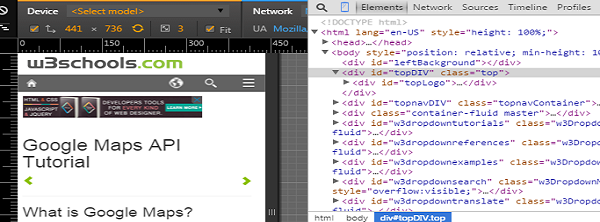
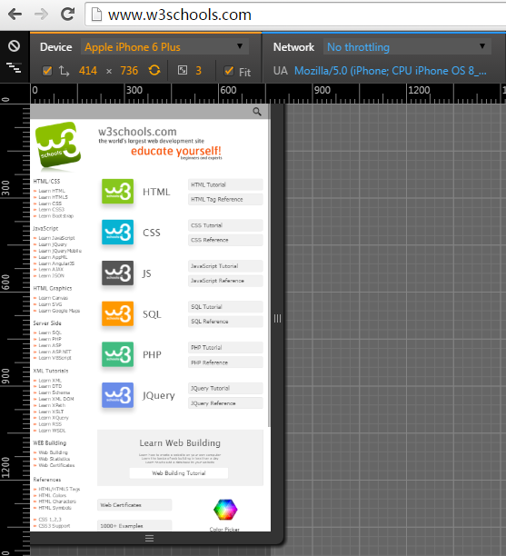
- Click mobile phone shaped icon
 at the top right.
 at the top right.
Then you are prompt to Chrome’s built-in user agent switcher. See above screenshot. When selecting different device, the user agent is changed accordingly. So I found the best tool to find user agents for different mobile devices. Remember you have to reload the page for proper user agent spoofing and Viewport rendering. On the left-hand side, click Elements button, now you can view the source code of the mobile site.

View source code of mobile site in Firefox
Mozilla’s Firefox browser is very popular among web designers, known for its powerful add-on system. Firefox does not have build-in feature to change user agent although it has the ability of responsive design view. But there are addons available to change user agent. It’s not very hard to meet our goal.
The following addons would add the ability to change User Agent in your FF browser.
- User Agent Overrider
- User Agent Quick Switch
- User Agent Switcher
Here I installed the the add on User Agent Switcher. You will be able to view the option to change user agent under Tools menu.

Click Edit User Agents and paste the new user agent. Refresh the page you will be able to view the mobile site of this page. Right click the page and click Inspect Element in the popup menu. You will be able to view the source code of the mobile site.

View source code of mobile site in Safari
Safari also has the built-in feature to change user agent. Before you view the feature, you have display Develop option in menu bar.
- Click Safari menu > Preferences > Advanced. Check Show Develop menu in menu bar.
- Click Develop menu > User agent and then change the user agent.
- Click Develop menu > Web Inspector -> Source and you will be able to view the source code of mobile site.

View source code of mobile site using PHP cURl
For a php designer, you can also use CURLOPT_USERAGENT of php cURL to change user agent in order to view the mobile site on desktop.
        $url = 'http://www.w3schools.com/';
        $ch = curl_init();
        curl_setopt($ch, CURLOPT_RETURNTRANSFER, TRUE);
        curl_setopt($ch, CURLOPT_CONNECTTIMEOUT, 5);
        curl_setopt($ch, CURLINFO_HEADER_OUT, 1);
        curl_setopt($ch, CURLOPT_FOLLOWLOCATION, 1);
        curl_setopt($ch, CURLOPT_URL, $url);
        $useragent = 'Mozilla/5.0 (iPhone; CPU iPhone OS 5_0 like Mac OS X) AppleWebKit/534.46 (KHTML, like Gecko) Version/5.1 Mobile/9A334 Safari/7534.48.3';
        curl_setopt($ch, CURLOPT_USERAGENT, $useragent);
        $body = curl_exec($ch);
        curl_close($ch);
        echo $body;
What you’ve described for mobile is inspecting the DOM, and is *not* the same as viewing the source.