
Think about the most well-known companies in the world, organizations like Google and Apple. Did their logos pop into your mind as well? Their logos are so strong that we can recognize them immediately, without any context and even when the letters are obscured.
A strong logo clearly is crucial for successful branding, and the strongest logos focus on three design aspects: the font, the symbol and the colours. Each of these elements is important, but the colour can be the difference between an anonymous symbol and a memorable logo.
Most logos, in the designer’s quest for simplicity, have only one or two colours, but incorporating lots of colours can suggest a company that is diverse and exciting.
We’ve brought together a collection of logos that use colour beautifully.
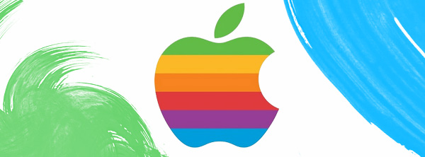
Apple
![]()
The original logo incorporated the entire spectrum of colours. It became an instant classic, and it established Apple as a company that was both tech-savvy and design-centric, the hallmarks that make it the tech giant it is today.
![]()
Google has a logo that verges on being boring, but because the logo is a mix of bold colours, it stands out more than your average text-based logo.
Mozilla Firefox
![]()
The Firefox logo is especially clever: as a desktop icon, it will have to compete with a user’s computer desktop wallpaper. The use of three bright colours means that the logo will pop against just about any wallpaper, making it easy for users to find quickly.
Burger King
![]()
Burger King’s use of primary colours suggests excitement, energy and – crucially for a fast food company – speed.
FedEx
![]()
Some logos, like FedEx’s, use colour to delineate different branches of the business.
MSN Instant Messenger
![]()
This references the Microsoft Windows logo and hints at the fact that messages sent over this service will fly across the internet.
eBay
![]()
Like the Burger King logo, eBay’s logo is fun, energetic and happy.
Picasa
![]()
What is better for a photo sharing service than a logo that incorporates several colours and looks like a shutter closing?
NBC
![]()
NBC first used a peacock logo in 1953 to promote the fact that more and more of the television network’s shows were shot in colour. They have stuck with the peacock, updating it ever so often to reflect modern aesthetics.
Terra
![]()
This logo is for a Spanish language web portal and internet service provider. The logo looks like a portal to a colourful world that is full of possibilities, which is perfect for the company.
Museum of London
![]()
The Museum of London logo looks like an archaeological dig and vaguely resembles the shape of the City of London. The colours make it look especially exciting.
Vibrant Drive
![]()
You would expect a digital design agency with the name Vibrant Drive to have a dynamic logo, and they deliver.
Erasm.us
![]()
Erasmus is a programm for international exchange students, and Erasm.us is a reference for students participating in the programm. This logo reflects the multi-faceted nature of the programm, the students and the resource.
University of the Arts London
![]()
The University of the Arts London logo emphasizes the university’s commitment to teaching future artists their skills, which is indicated in its use of colour. Interestingly, the stars are an indication of where the university’s six campuses are on a map of London.
The Islands of the Bahamas
![]()
This logo, for the tourist website for the Bahamas, shows that whilst the islands have a similar culture, they are all distinct. It says a lot with only a few shapes and colours.
Have you found any stunning examples of colourful logos that deserve a mention? Let us know in the comments.